


Image by Negative Space/Pexels
One of the main-stays in the analytics toolkit, Excel continues to captivate employers and data analysts for its analytical efficacy.
Whether it’s the user friendliness, calculations power or relevance with newer tools, Excel stands as the top data management and preparation tool in the modern analytics toolkit.
You must be wondering how, in the presence of SQL, Python 3.11, Power BI and Tableau, Excel still holds the attention of data experts?
This article credibly states how exactly, in this era of newly emerging data tools, spreadsheet software like Excel brings incredible value for data analysts.
Table of Contents
- How mature is Excel in Data Analytics?
- An Example of what you can do with Excel.
- 3 Fantastic Qualities of Excel in Data Analytics
- The Power and User Friendliness duo
- Excel builds a strong foundation for Data Analytics
- Excel is a doorstep to Future Analytics
-> Excel’s maturity in Data Analytics
Microsoft Excel is an industry leading spreadsheet software that’s equipped with fantastic features letting analysts perform powerful analysis and visualizations on data. Over 40 years of evolution, Excel remains one of the oldest data analytics platform, providing ease with its GUI and intuitive formula approach.
In the current, Excel equips vast and extensive features that make it an ideal choice to get started with data. Consider the following examples as the attractive utility of Excel:
- As vast as 41 types of file formats are supported in Excel. Users can ‘get data’ from for example: text, image, xml and JSON files.
- In the data driven world, the ODBC driver in Excel seamlessly imports data from enormous sources including 12 commercial databases, the Power BI platform and the Azure cloud.
- The vast 500+ functions in Excel covers the whole gamut of analytical calculations, offering users another privilege from its supreme analytics capabilities.
- Enabling experts and novices to save time and effort, the ‘Analyze Data’ feature in Excel runs intelligent analytics on the data in just a single click. Organizations find this feature useful in enabling an enterprise wide data democratization (aka data culture).
-> What can Data Analysts do with Excel?
With Excel, you can learn to build state of the art analytics dashboards as shown in the graphic. Within just a few clicks the dashboard becomes ready thanks to the advanced user-friendly features of excel such as Pivot Table and Pivot Charts.

-> 3 Fantastic Qualities of Excel in Data Analytics
This section briefly outlines the three best reasons why Excel is still prevalent in Data Analytics especially in contemporary subjects such as Power BI, Tableau, SQL, Python, and R programming.
1. The Power and User Friendliness duo
One glamorous quality of Excel is its power-friendliness duo. When Excel commenced back around 40 years ago, it was made intuitive and user friendly by design. While newer functionalities have been added from time to time, the ease-of-use remained true to the original.
Combined with Excel’s ginormous library of 500+ calculators (aka Excel functions), the power-friendliness duo reasons to become the choice of millions of users worldwide (Microsoft Office and 365 services occupied 87.5% of the market in 2018; cited in a G-suit comparison report).
Experts and starters find it easy to write and use Excel’s massive pool of functions which can also be embedded as part of a formula, and perform insight extraction in the most powerful way.
Discover and learn to use Top 15 most powerful Excel Functions for Data Analysis, in our easy and step-by-step guide.
Apart from the expediting calculations, some other attractive aspects to the ‘Power’ of Excel are as follows.
Pivot Table: Users can build amazing analytics in Pivot Tables without needing to apply functions and formulas. It’s a quick way to summarize large datasets where users can view subtotal, aggregate results, or select other custom calculations, at category and subcategory levels. The intuitive drag-and-drop panel of the pivot table provides the flexibility to users to summarize numeric data across any field of their choice.
Additionally, with Pivot Tables, users can ‘Filter’ data within their summary.
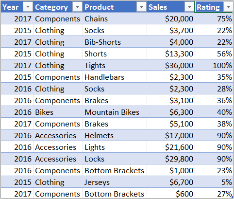
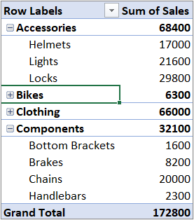
An example of Pivot Tables in Excel. The table (T) represents data on worksheet whereas the corresponding Pivot Table (B) represents summary (Sum of Sales) across Category and sub-category (products) of the table. Also note the drop down button on top of Pivot Table that filters data as per user’s choice.
Pivot Chart: Taking ease of analysis to the next level, Excel’s Pivot Charts enables a visual analysis on the Pivot Tables. This feature allows users to see comparisons, patterns, and trends in the summary of their data.
Another excellent utility of Pivot Charts is their filter drop downs that allows users to analyze visuals on data across various fields on the run time (as shown in the image below). This user-friendly feature is especially important in the context of non-technical staff in an organization.

Slicer: In Excel, Slicer works just like a Filter except it enhances the user-friendliness by adding buttons for tables and pivot tables. This means, instead of going to a separate Filter option, a user can quickly press buttons on the worksheet to filter data across the tables.

These are just a few examples of Excel’s utility whereas users can accomplish so much more such as building KPI dashboards, perform complex statistical analysis in a single click, and connect to Power BI dashboards.
In a nutshell, Excel provides a vast number of powerful and user-friendly features that attract organizations to utilize its analytics prowess and accomplish workloads in a short time, without requiring Herculean effort.
2. Excel builds a strong foundation for Data Analytics
Excel is prevalent in the global analytics scape. As an easy start, Excel paves way for analysts to learn data analytics hands-on. Once a data analyst becomes Excel savvy, it becomes easy to adopt the more flexible and powerful BI environments such as Power BI and Tableau. These tools, along with Python, and R programming, can process large datasets and support more complex analytics.
One can build a smooth ground of analytics hands-on with Excel by working on for example: data cleaning; data modeling; data analysis (trend, time and comparison analysis); and building interactive KPI dashboards. It only makes sense that with a strong understanding of data management and analytics, one can move to automate Data cleaning and transformation in Power BI and Tableau at the data warehouse level.
3. Excel is a doorstep to Future Analytics
In the contemporary analytics realm, change is the only constant. While newer analytics tools try to compete with Excel, it still remains difficult for BI tools to raze spreadsheets on ground. At the same time, Excel continuously integrates with emerging technology to create a seamless data analytics experience that thrives on its unique capabilities.
3.1 Power BI with Microsoft Excel
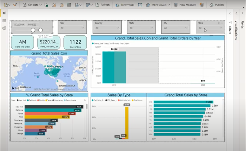
To demonstrate this, Excel places a Power BI connection that brings the glitzy visuals of Power BI right into Excel and where the dashboard feeds on data from Excel.
Here’s a glimpse of a Power BI dashboard in Excel. In this video clip, Mr. Mohsin Mahmood (an accomplished analytics expert) shares a real-world example of a Power BI dashboard connection in Excel. View the complete data literacy webinar (Microsoft Excel, a gateway to Analytics) by Mohsin Mahmood.
3.2 Tableau with Microsoft Excel
Another example of Excel’s compatibility with newer platforms is that of Tableau. Tableau runs on the philosophy of making data analytics simpler and easier and finds an ideal match with Excel.
With a native connection with Excel, Tableau invites Excel experts to import their worksheets and perform simpler and more interactive analytics. For example, in Tableau users can analyze Excel data on a single page, instead of answering business questions in separate tabs on Excel.
Learn more about how Tableau improves upon Excel in their dedicated white paper.
From the above examples, it makes clear to us that in the disruptive technology landscape, Excel remains a sustainable option for companies and data analysts. A flourishing data analytics journey is promised for the stakeholders.
To Wrap Up, Excel is the core skill in Data Analytics!
Start building your Excel skills today.
Join many others at Dice Analytics in an 8-weeks expert-led live training on Data Analysis using Advance Excel and SQL. In this training, industry experts meticulously create a 3 skills syllabus, creating a trio value for aspiring individuals. These skills are: Excel, SQL and Storytelling (Power Point).
View training details for Data analysis using Advance Excel and SQL training.
What’s the value for you?
At the end of this 8-weeks hands-on intensive training program, learners will be adding most in-demand data analytics skills in their profile. The contents of the course include:
Excel (4 weeks): functions (basic to advance), pivot table, pivot chart, data modeling, power query, power pivot, interactive dashboards, KPI dashboards, protecting and sharing dashboards, trend analysis, time analysis, and comparison analysis.
SQL (3 weeks): Introduction to Database management, DDL/DML, basic SQL query hands-on, window aggregate functions, hands-on practice of challenging real-world problems.
Power Point (1 week): presentation and data storytelling basics on powerpoint, slide sizing and layout, tables and image presentation, slide transitions, and time saver powerpoint shortcuts.
View detailed outline and registration information at our web page for Advance Excel and SQL training.