


Have you been keeping a business problem in your mind that you want to solve?
This article is an inspiration for professionals who want to use Excel to solve business problems.
We present 4 Excel features that are friendly and powerful in use. These features will help you set a base on how to do your analytics objectives.
So let’s dive-in into the top 4 Excel features for business analytics.
1. Functions
Excel functions help to put in place any sort of business mathematics. It has a vast function set, nearly 500 functions, that offer analysts to implement any business scenario.
For example, if a business analyst wants to see how much a customer contributes to the total sales, they would calculate sales per order as follows.
sales per order = (revenue – profit) total orders
To implement this formula in Excel, the analyst would use a SUM function in combination with COUNT and division operator (forward slash ‘/’) as follows.
sales per order = SUM(A:A, – B:B)/COUNT(C:C)
As a second example, consider a business analyst who wants to categorize customers based on their sales. The logic would be as follows:
IF current sale > average of sales, then high value customer; ELSE low value customer
To do the above in Excel, the analyst would use the IF function to categorize data as follows.
IF(D:D > AVERAGE(D:D), “High value customer”, “Low value customer”)
2. Pivot table
A pivot table in Excel is a one-click feature that lets you analyze your data without the hassle of entering functions.
It helps to pack your data into a compact table that views a summary of the whole data. Additionally, you can also create custom formulas as per your business problem.
A pivot table makes the work easy for you. As an example, you don’t need to use IF function to categorize data, a Pivot table automatically detects categories in data.
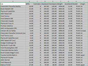
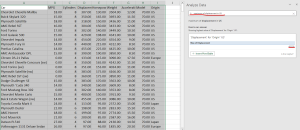
In the image below an example dataset of cars is presented with car name and its features such as MPG, cylinders and displacement etc.
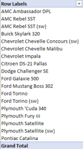
When we create the pivot table, our data automatically gets categorized as shown in the image below.
Pivot: to turn, as the name suggests also offers you the flexibility to view data as per your choice.
It does this with its toolbar (positioned at the right side of the screen) that lets you drag and drop table fields and set data across rows and columns of your pivot table.
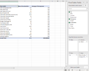
Also, another useful feature of the Pivot table is that it allows you to view summary of data without having to apply functions.
You can view 11 summaries including sum, average, min, max, product and standard deviation by dragging fields on the ‘Values’ area. Then, in the drop down of a field, ‘set the value of the field’ as the summary of your choice.
Besides summaries, you can create your own custom formulas to analyze and explore your data in a pivot table.
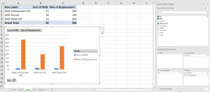
3. Pivot chart
Pivot chart is another amazing tool that lets you visualize your data in a single click. Simply stating, a pivot chart is a graphical extension to the pivot tables. All benefits of the pivot table are retained, just that we now get a visual view of the data.
One can visualize data summaries just like in the Pivot table, as well as create custom formulas to deeply explore and analyze business data.
Here’s how a pivot chart looks like for our cars dataset. You simply select the data in your table and Insert a Pivot chart. You choose the fields of your choice in the options just as you would do for a Pivot table.
4. ‘Analyze Data’
One incredible feature in Excel, even further than Pivot table and pivot chart, is the ‘Analyze Data’ feature. It lets you write human friendly queries and returns analytics as a result.
Take a look at the example of how we can use prompts to quickly get insights from data. At the analyze data tab (on the right corner of the screen), we ask Excel to output ‘maximum’ of the ‘displacement’ in ‘US’. Excel shows the highest value of Displacement for Origin US and returns a value of 455.
‘Analyze data’ provides suggestions as well. It can self build a pivot table and pivot charts which you can also update in the options. This makes your business analytics work extremely simple and easy.